WEBSITE REDESIGN: PROFESSOR LAURA K. ALFORD
PURPOSE:
For my Web Design, Development, and Accessibility class, we were given the task of rebuilding a website with a team of two other students.
GOAL:
To redesign University of Michigan professor Laura K. Alford’s personal website. The goal was to be able to give the professor all HTML/CSS files so they could hopefully use this as their new website and make changes accordingly. We had to operate under the assumption that this individual had little to no knowledge about web design and make our files easy to follow.
CHALLENGES:
We focused on four main areas of the website in order to improve its overall usability:
Give the website a more interesting and consistent look in terms of color palette, typography, layout, etc.
Implement thoughtful and intentional responsive design choices (desktop, tablet, and mobile views)
Organize a large amount of content to be easily digestible and thoughtfully separate static information from information that is subject to change
Ensure that all features of the website were fully accessible
SCOPE:
HTML5, CSS, JavaScript, jQuery, GitHub, Web Design, UX Design, Accessibility
To view the redesigned site, click here.
To view the original site for comparison, click here.
To view the GitHub repository, click here.
DEVELOPMENT & DESIGN:
COLOR PALETTE & TYPOGRAPHY:
Laura’s initial website had little to no color scheme. Because Laura is a naval architect and marine engineer, we wanted to incorporate a sea-foam color scheme on the website to embody her interests and rather quirky personality. Additionally, we chose a simple sans-serif font for typography that is easy to read for users and is consistent across all pages.
RESPONSIVE DESIGN:
We designed Laura’s website to be compatible with three different screen views: mobile, tablet, and desktop. Depending on the device a user is on, the appearance of content and the navigation changes accordingly.
For the navigation bar in the mobile view, we stacked the links vertically on top of each other to make it easy to read and click on each link. Our tablet view navigation combines both aspects of the mobile and desktop (i.e., the logo on top of the text in the mobile view and the links displayed horizontally in the desktop view). We based our navigation on commonly used navigation styles from popular websites which allows users to easily navigate the website without a steep learning curve.
In terms of the main content on the page, we standardized the look of each page on the desktop and tablet views by putting a block of text alongside corresponding media such as pictures and videos to maintain relevance. For certain pages, we maximized variability by changing how content was laid out. For example, on the Tandem page, the order of images and paragraphs changes between tablet and desktop mode. This ultimately introduces different yet consistent styling choices and diversity in presenting the same information.
CONTENT ORGANIZATION:
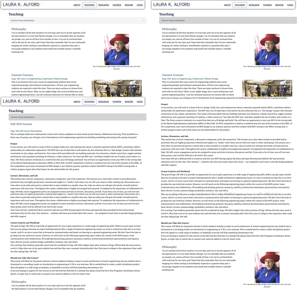
To organize the main content of Laura’s website, we began by simplifying the sitemap to give the navigation bar a cleaner look. By combining the Teaching page with the ENGR 100 class description page and giving Tandem its own page, we made the navigation bar far more visually appealing and easy to follow, stripping unnecessary information from the navigation system.
On both the Research and Teaching pages, we saw an opportunity to separate static content from content subject to change. We stored this information in drop-down accordion menus achieved using JavaScript. This allowed us to create space for Laura to add and subtract content as it changes (i.e., updates on her current research openings or current courses) without interfering with the layout of the content she intends to remain the same on the pages.
Additionally, on Laura’s Interesting Links page, there was an overwhelming amount of content on the screen at once. We used accordions once again to make it more digestible and less overwhelming upon first glance. Our design choice not only makes the page less overwhelming, but it gives the user the autonomy to choose whether or not they’d like to view this content. Below is a comparison of the original and redesigned Links page.
ORIGINAL LINKS PAGE
REDESIGNED LINKS PAGE
ACCESSIBILITY:
As with any thoughtfully designed website, our website was designed with accessibility as a priority. As designers, we should always consider the needs of all potential website users, be they disabled or someone facing situational barriers. Laura’s new website passes multiple accessibility validators (Wave, Axe, W3C) which check for keyboard-only functionality, compatibility with screen readers, color contrast, and more.
As a first step in making our website accessible, we looked into making all features keyboard accessible — not just mouse accessible. For those who might struggle to scroll through the webpage, we added a “skip to content” button that allows a user to view the main content of a page by simply pressing tab and then enter. Additionally, users are able to tab through all links (in both the navigation and main content) and all accordion drop-down menus, and use the enter key to access that content. For those using a screen reader, we added alt text (alternative text) to all of our pictures and ARIA labels to videos and buttons and verified their functionality using Axe and Wave accessibility testing.


